Iconography
Icon Usage
Clear and consistent icon usage strengthens both usability and brand recognition. When paired thoughtfully with other design foundations such as typography and color, icons provide intuitive cues that simplify navigation and enrich the overall experience. This section defines the principles for applying iconography effectively across products and interfaces.
Sizing & Structure
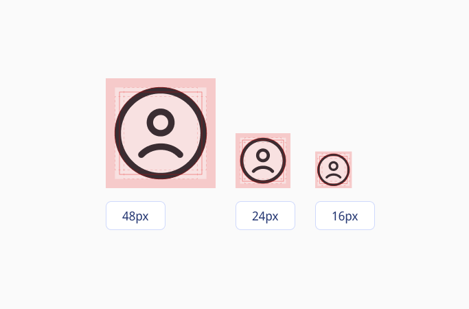
Icons are available in 48px, 24px, and 16px to support different interface needs. The 24px icon is the foundation size, designed with a 1. 5px stroke weight. For other sizes, stroke weights adapt proportionally to ensure shapes remain balanced, legible, and visually consistent across all scales. This approach preserves clarity at smaller dimensions while keeping larger icons light and harmonious within the system.
All icons follow a consistent grid with keylines for proportion and alignment, and safe space to ensure clarity. This creates a sharp, balanced, and cohesive icon set across all contexts.
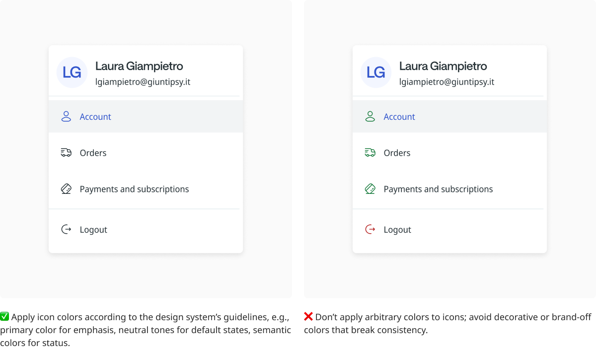
Color
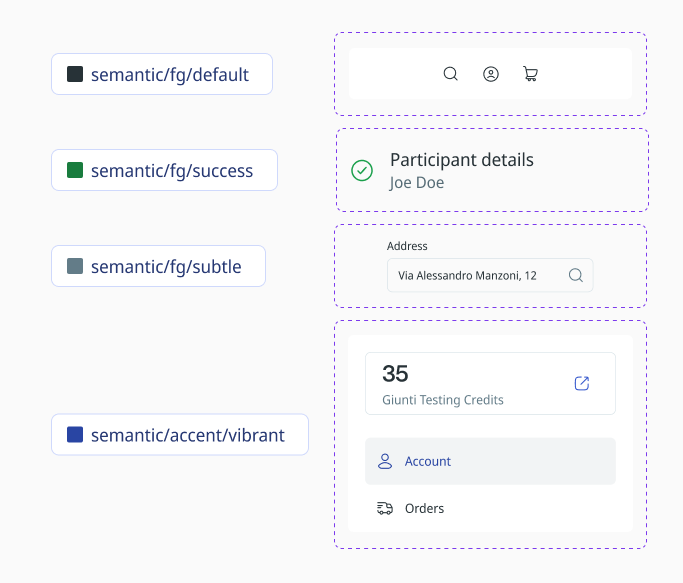
Icons adapt their style to context, component, and interaction. By default, they follow the primary foreground color or match text when paired with labels. Semantic icons such as alerts, confirmations, or information use semantic colors, while secondary or placeholder icons take on more subtle tones. Action icons that stand alone adopt vibrant accent colors to draw attention, and when placed on semantic backgrounds, icons switch to an inverse scheme to ensure clarity and contrast.
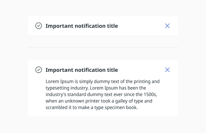
Alignment
Icons can be placed either in the middle or at the top next to text, depending on the amount of text. For short text of one or two lines, centering the icon keeps the layout balanced. For longer text of three lines or more, aligning the icon to the top helps maintain a neat layout and prevents awkward spacing.
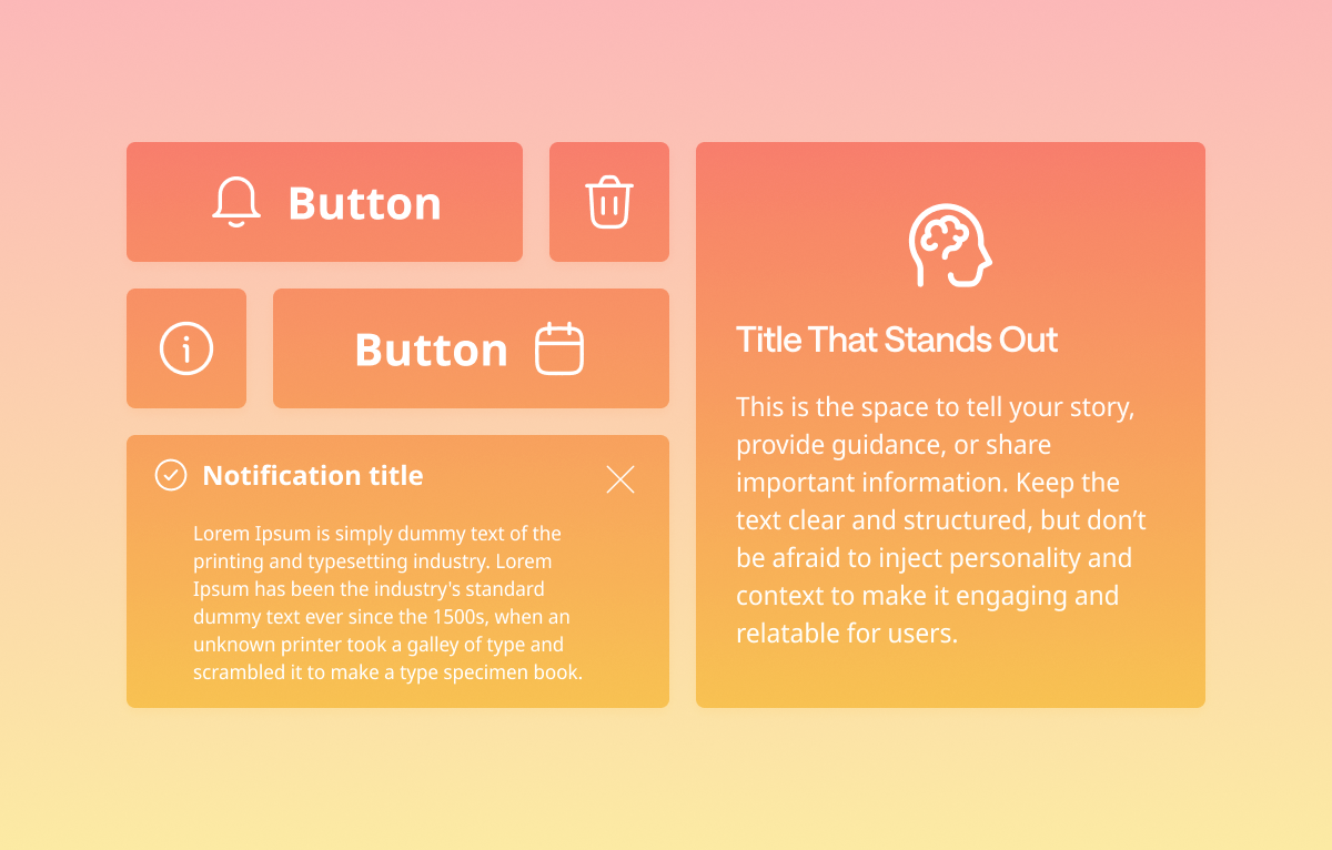
Icons in Buttons
Button Icons
Buttons can include icons in three ways:
- Leading: Icon appears before the text.
- Trailing: Icon appears after the text.
- Icon-only: Button contains only an icon, without text.
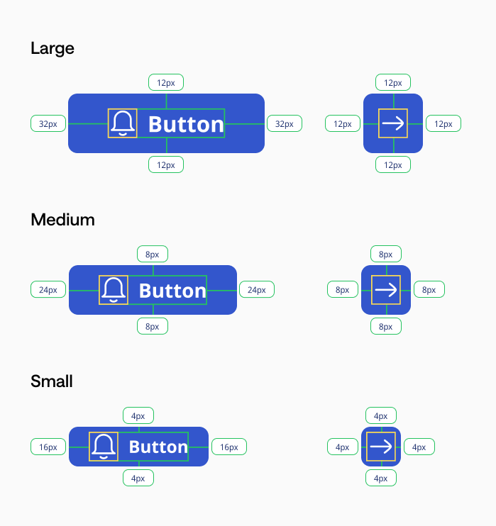
Icon Size
All icons use a consistent 24x24px size.
Padding by Button Size
- Large: 32px horizontal, 12px vertical
- Medium: 24px horizontal, 8px vertical
- Small: 16px horizontal, 4px vertical
Icon-to-Text Spacing
The space between icon and text is always 8px, regardless of button size.
Icon-only Buttons
Use fixed paddings (different from text buttons) to keep the icon visually centered and maintain proper touch area, as specified in the reference image.
Design Intent
This system ensures consistent alignment, balanced spacing, and visual harmony across all button sizes and types.
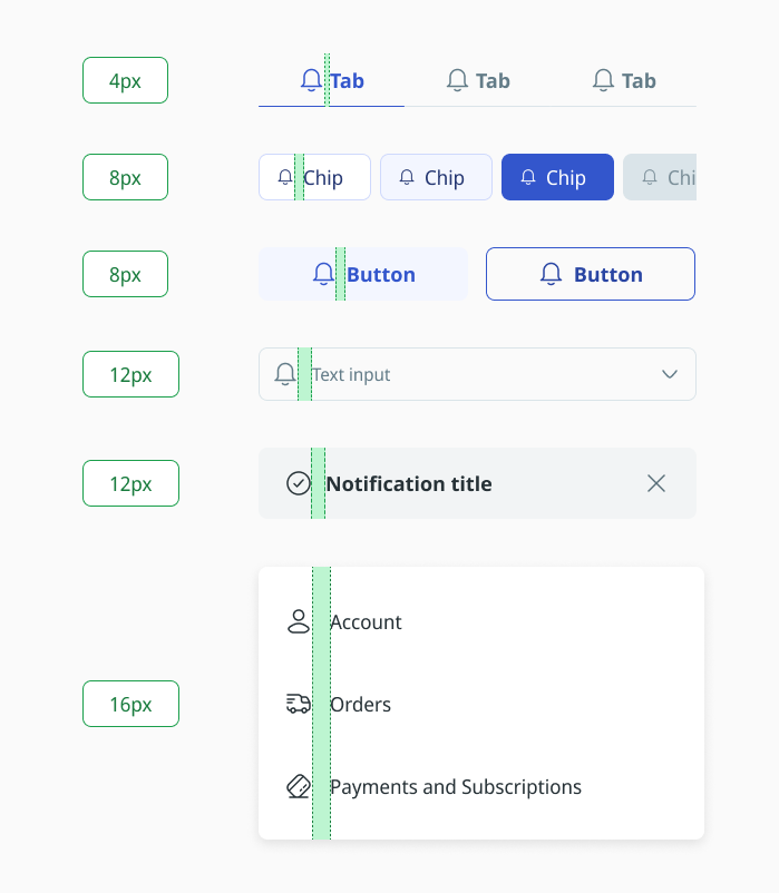
Spacing Icon & Text
The spacing between an icon and its accompanying text is determined by the component type and the length of the label. Short labels use a baseline gap of 8px to keep the icon visually connected to the text, while longer labels increase the spacing proportionally to maintain readability and prevent clutter.
Icons are always vertically aligned with the text to preserve a balanced layout. In chip components, the icons themselves are 16px in size, ensuring they fit the compact design. This approach ensures that icon-text combinations remain clear, legible, and visually harmonious across buttons, chips, list items, and other components throughout the design system.
Usage guidelines
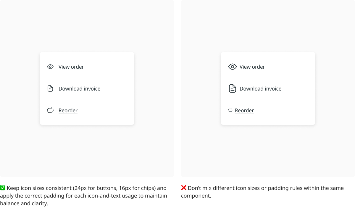
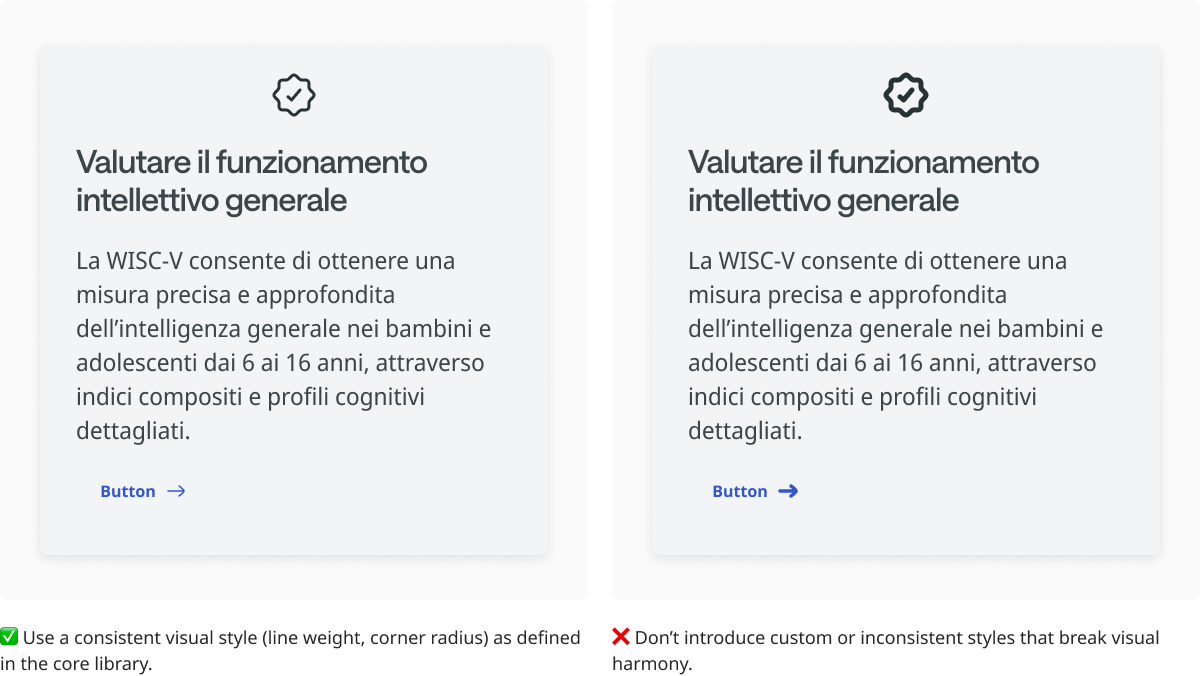
Icons should be clear, consistent, and legible across all components. They must complement text without overpowering it, maintain proper alignment, and use spacing that preserves balance and readability. Consistent sizing, padding, and placement ensure a cohesive and intuitive interface.