Color
Color Usage
Color is more than visual appeal it's a functional tool that guides users, signals meaning, and strengthens brand recognition. This page outlines how to apply our brand, grayscale, and functional palettes in a way that ensures clarity, accessibility, and consistency across digital experiences.
Accessibility & Contrast
Always check that color combinations meet WCAG 2. 1 AA contrast standards for text and UI elements. Color should never be the only way to communicate meaning use icons, labels, or patterns when necessary.
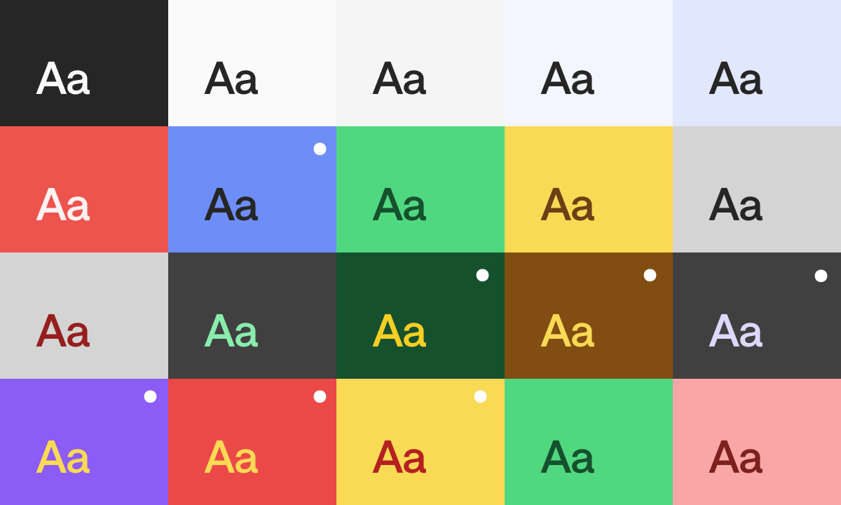
Even when combinations pass contrast tests, consider visual balance and clarity. Avoid pairings that introduce unnecessary visual noise or disrupt the overall harmony of the interface (●).
Use Brand Colors Where Possible
Whenever you’re creating a PowerPoint, document, social post or applying the brand to any other format or surface, try to use our approved brand palette. These colors were chosen for a reason: they reflect our identity and ensure we always look like us. Even black and white aren’t always the same. We use specific tones to maintain visual harmony and contrast. Using the exact values helps everything feel intentional and aligned.

Color Is Strategy, Not Decoration
Color is a powerful tool that communicates mood, intention, and identity. When used intentionally, it helps us guide attention, build hierarchy, and create accessible and unified experiences. Stick to our approved palette, apply contrast wisely, and always design with clarity and purpose in mind.
Color is not just a visual name (it’s a strategic choice). And just like color, using each of them needs care and intention. As you scale your designs, aim for a consistent color scale, and test every visual element on its job with clarity and impact.