Typography
Overview
Typography is a key element of the Giunti Psychometrics identity, contributing to the clarity, tone, and accessibility of all communications. Our typographic system is built on simplicity and legibility, balancing personality and functionality
Typefaces
WWe use two primary typefaces across our design system:
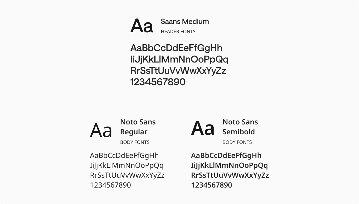
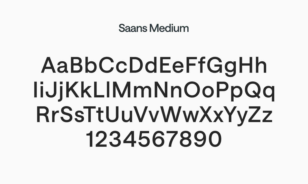
Saans Medium
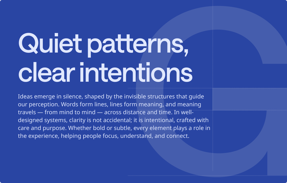
Used exclusively for titles and large display elements. With its clean and modern structure, Saans conveys a confident and professional tone.
Saans is a licensed typeface. Please contact the Corporate Marketing team for access.
Noto Sans
Selected for its high readability and broad language support, Noto Sans is used for all paragraph text, captions, labels, and UI elements. We use only the Regular and Semibold weights to maintain visual clarity and consistency.
Available via Google Fonts.
Saans Medium
Saans Medium is a display typeface we use exclusively for titles and key headings. Designed by Displaay Type Foundry, it combines humanistic warmth with geometric precision, making it both approachable and refined. Its subtle curves and generous proportions give our titles a distinctive and modern voice, while reflecting Giunti Psychometrics’ commitment to clarity, order, and trust.Though not used as our primary typeface, Saans plays a vital role in reinforcing the brand’s elegance and seriousness across high-visibility text.
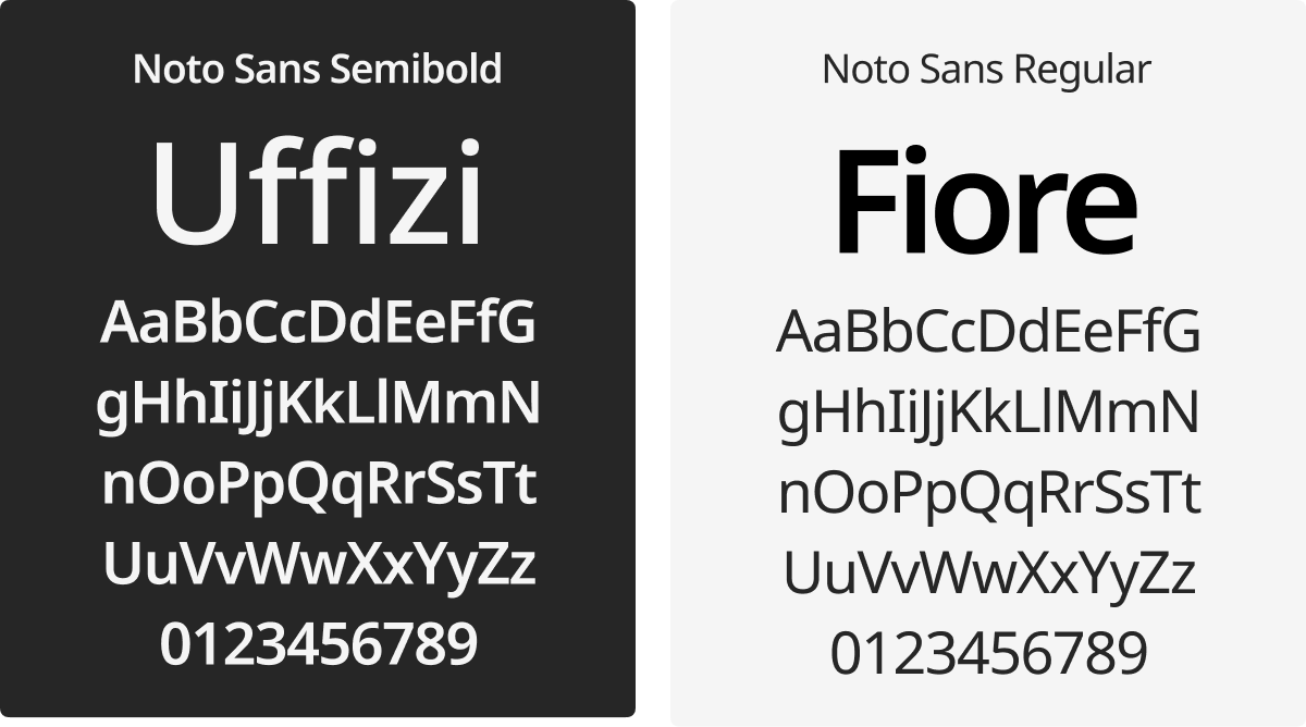
Noto Sans
Selected for its high readability and broad language support, Noto Sans is used for all paragraph text, captions, labels, and UI elements across digital and printed materials.
We use only the Regular and Semibold weights to maintain consistency and clarity. Its modern neutrality makes it a reliable choice across a wide range of applications.
Typography for Print
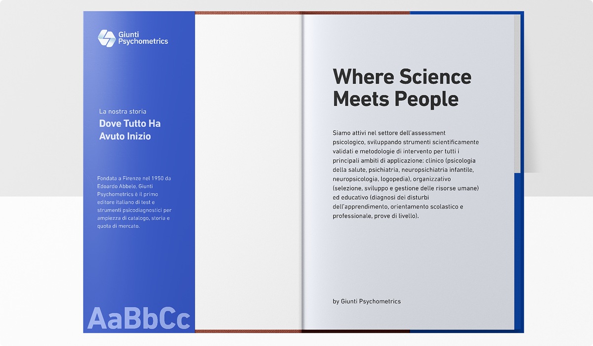
For all printed materials including books, notebooks, tests, catalogs, and other offline communications we use DIN Next LT Pro. This typeface is specifically selected for its legibility, technical precision, and clean geometry, making it ideal for structured layouts in editorial and scientific contexts. It offers a strong typographic presence while maintaining clarity across different print sizes and formats.
DIN Next LT Pro is a licensed font, legally acquired for use by the team responsible for our printed materials.