Typography
Type Usage
Typography is a key element of the Giunti Psychometrics identity, contributing to the clarity, tone, and accessibility of all communications. Our typographic system is built on simplicity and legibility, balancing personality and functionality.
Typefaces in Use
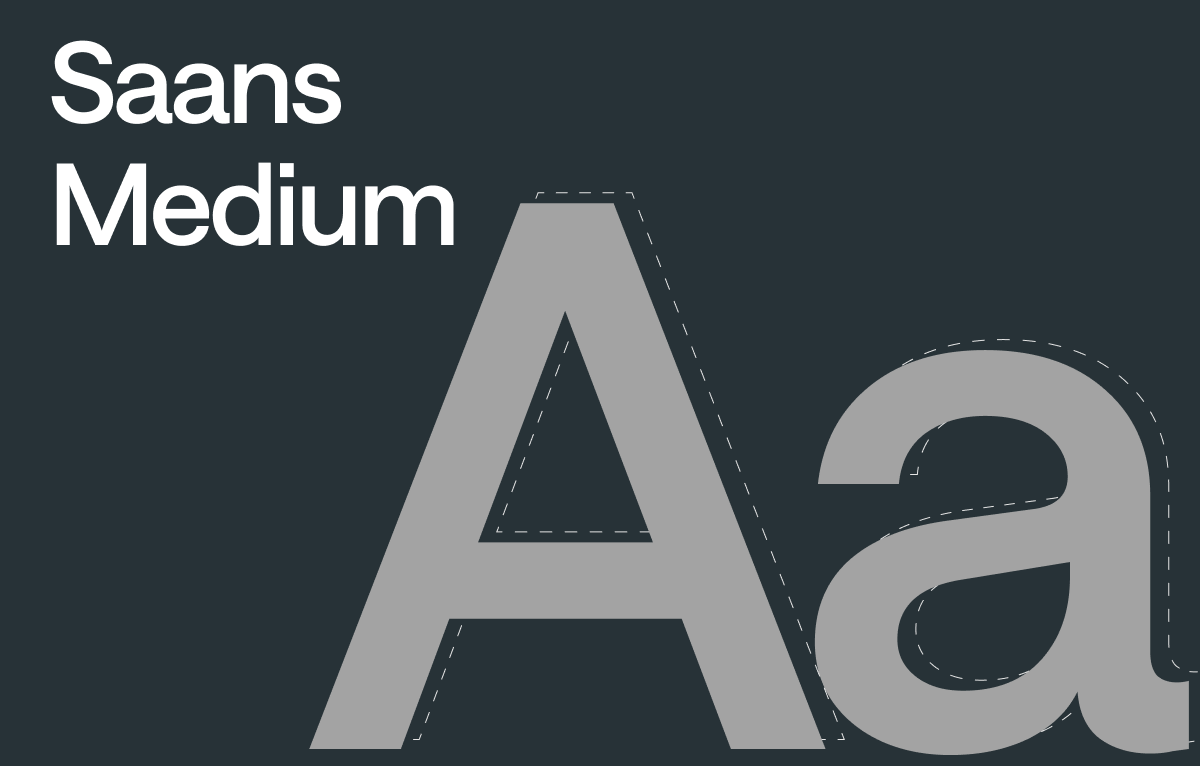
Saans Medium
Used exclusively for titles and large display elements. With its clean and modern structure, Saans conveys a confident and professional tone.
Saans is a licensed typeface. Please contact the Corporate Marketing team for access.
If you don't have access to Saans, don't worry you can use Noto Sans for titles as well.
Noto Sans
Selected for its high readability and broad language support, Noto Sans is used for all paragraph text, captions, labels, and UI elements.
Available via Google Fonts.
Optimal Line Length
The ideal line length isn't just a stylistic preference. It's backed by decades of research. Studies collected in “Line Length Revisited: Following the Research” show that excessively long lines reduce reading speed, increase unnecessary eye movements, and hinder visual comprehension.
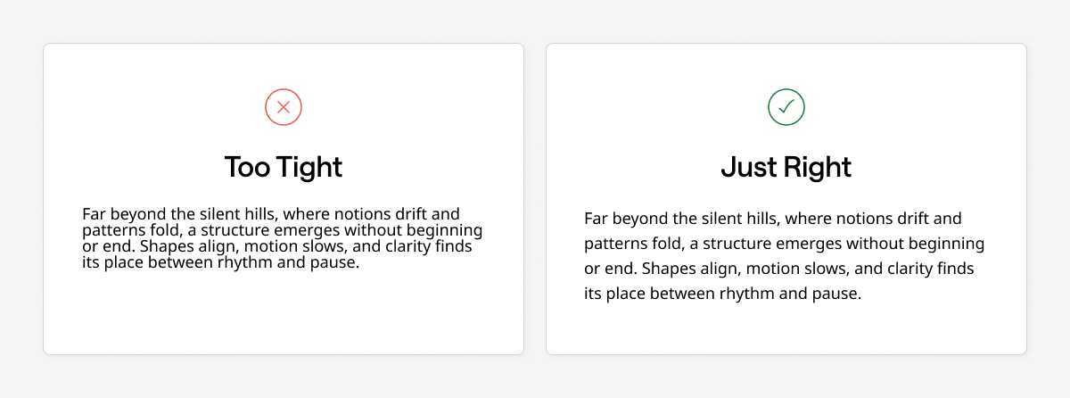
That's why we recommend keeping line lengths between 50 and 75 characters whenever possible: it enhances reading experience, improves legibility, and prevents visual fatigue in both digital and print formats.
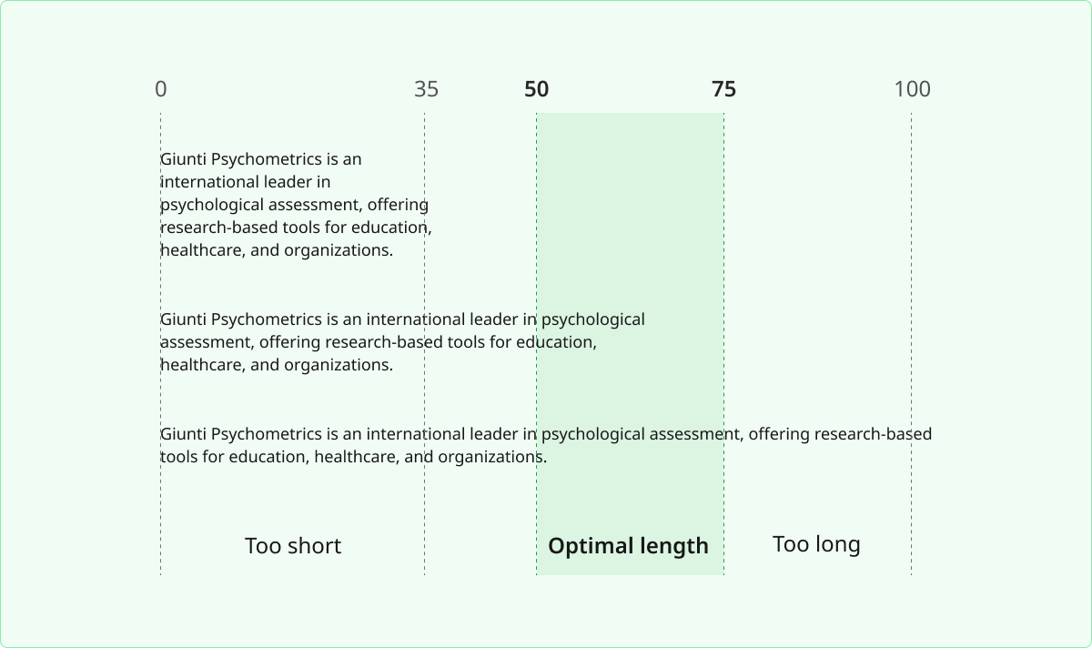
More information: How to Improve Readability: The learner can refer to Research Findings.
Line Height Matters
Line height, or the space between lines of text, plays a key role in how easy it is to read. For body text, we recommend using a line height around 150% to 160% of the font size. This gives each line enough room to breathe and makes reading more comfortable. For shorter text like headings or labels, a slightly tighter spacing (around 120% to 130%) helps keep them visually compact and strong.
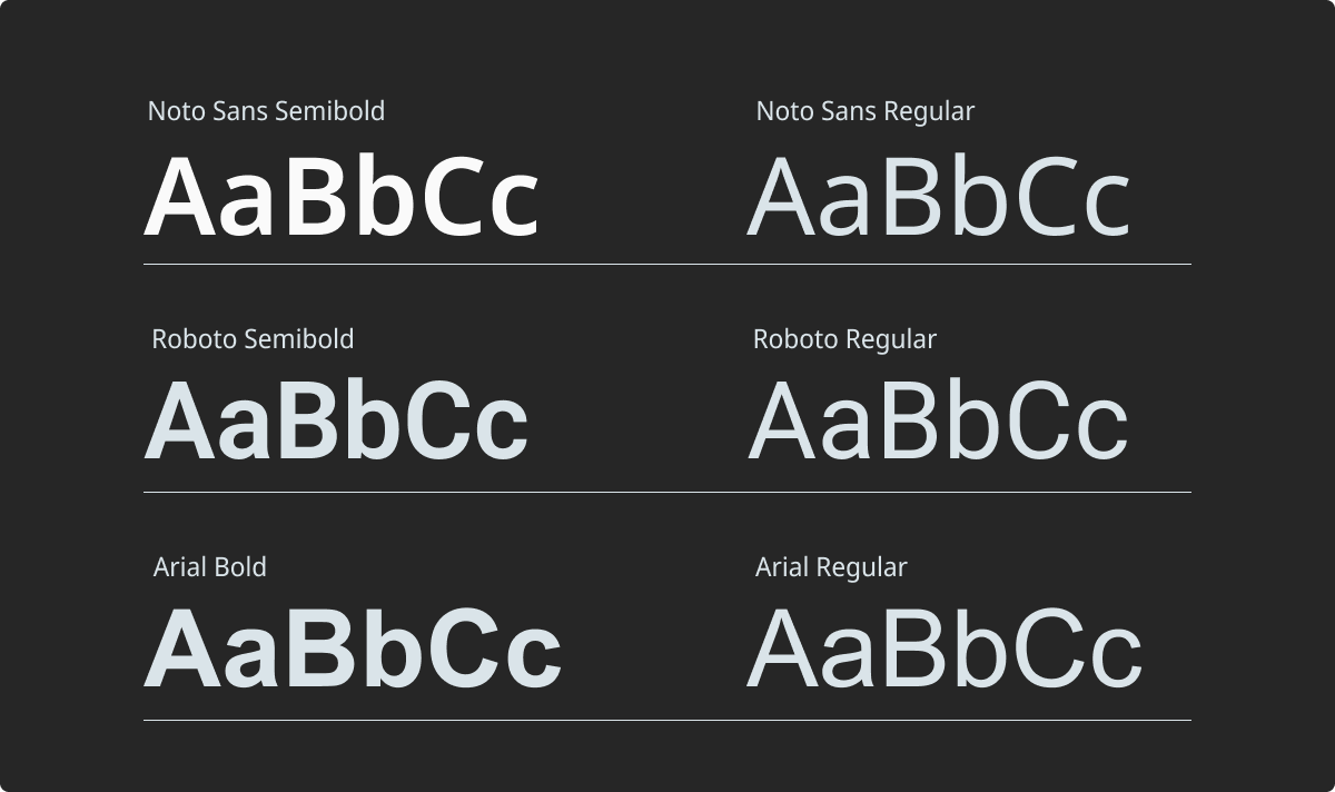
Alternative Typeface Options
If Noto Sans Regular or Semibold is not available in your design environment, you can use alternative typefaces that offer similar legibility and neutrality. These options ensure consistency and accessibility, especially for digital and screen-based outputs. When selecting a fallback, always prioritize clarity, international support, and a tone aligned with Giunti Psychometrics’ visual identity.